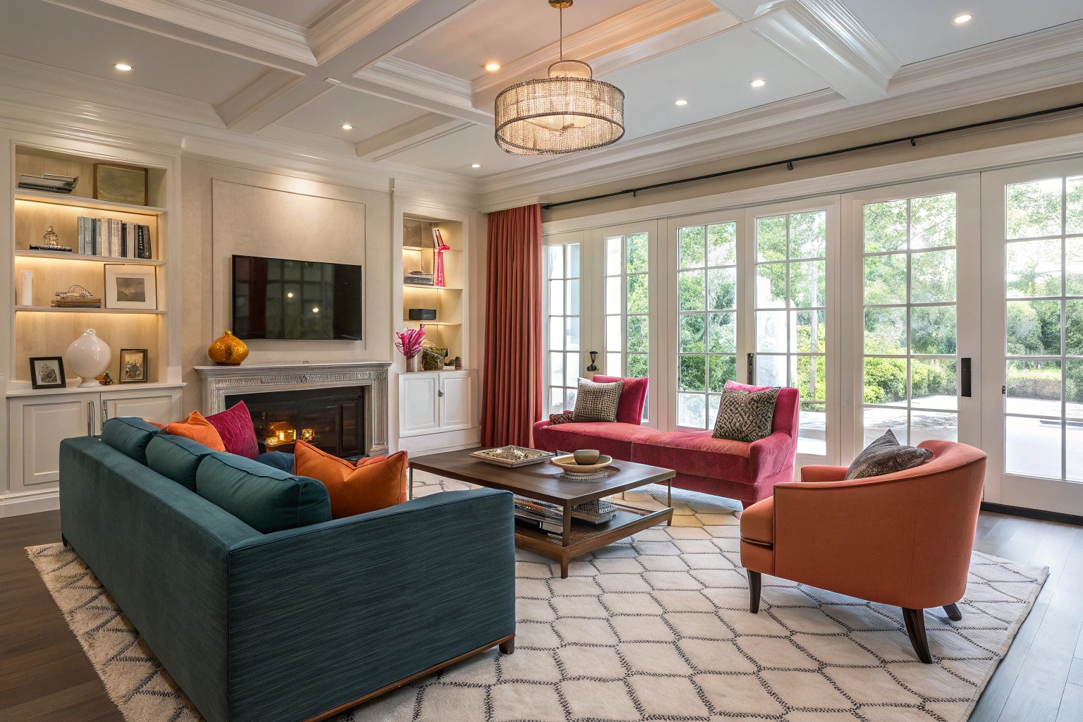
After twenty years in this field, one thing becomes abundantly clear: interior design is both an art and a science. When clients walk into a perfectly designed space, they often can’t articulate why it feels so right—they just know it does. That magical quality comes from the thoughtful application of fundamental design principles that create harmony, balance, and visual interest.
Color Theory: The Foundation of Visual Experience
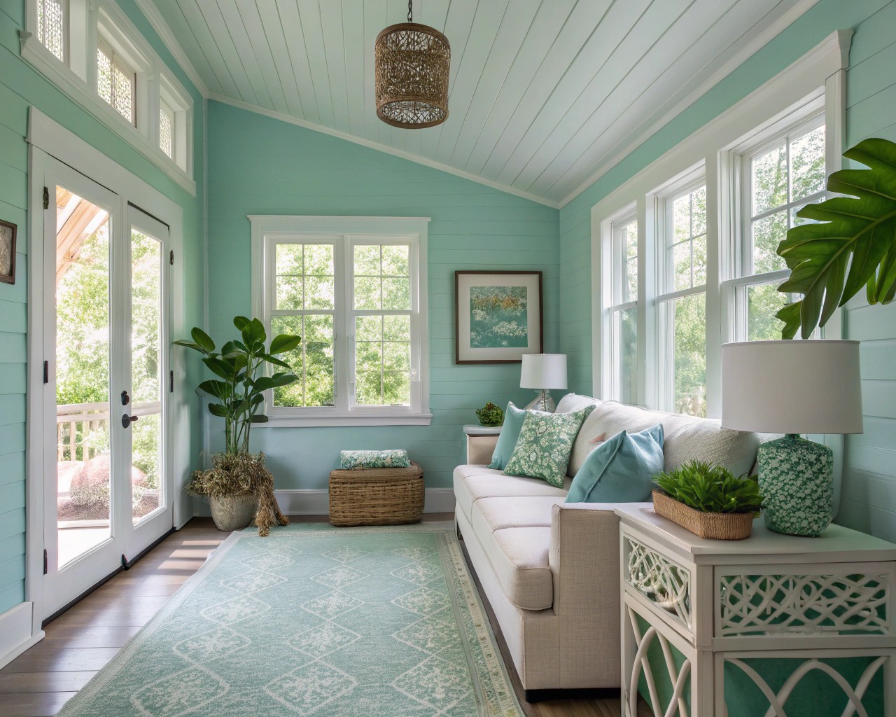
Color is arguably the most powerful tool in a designer’s arsenal. It establishes mood, affects perception of space, and creates emotional responses that can transform how we experience our environments.
The Color Wheel Basics
The color wheel serves as our compass when navigating color relationships:
- Primary colors: Red, blue, and yellow—the building blocks from which all other colors derive
- Secondary colors: Green, orange, and purple—created by mixing primary colors
- Tertiary colors: The in-between shades that fill the gaps and create nuance
Essential Color Schemes
When developing a palette for clients, I typically work with these proven schemes:
| Color Scheme | Description | Best Used For |
|---|---|---|
| Monochromatic | Various tones of a single hue | Creating depth without complexity |
| Complementary | Colors opposite on the color wheel | High-energy, dramatic spaces |
| Analogous | Adjacent colors on the wheel | Harmonious, cohesive environments |
| Triadic | Three colors equidistant on the wheel | Balanced yet vibrant interiors |
Warm vs. Cool Colors
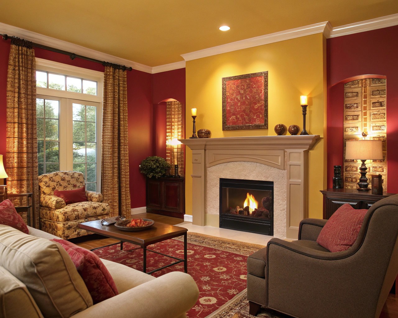
The temperature of colors significantly impacts the feeling of a space:
- Warm colors (reds, yellows, oranges): Create energetic, inviting atmospheres perfect for social spaces like kitchens and living rooms
- Cool colors (blues, greens, purples): Establish calm, relaxing environments ideal for bedrooms and bathrooms
When selecting colors for a project, always consider the light exposure of the room. Northern light tends to bring out cool undertones, while southern exposure enhances warm tones—a crucial consideration when finalizing a palette.
Proportion and Scale: Creating Visual Harmony
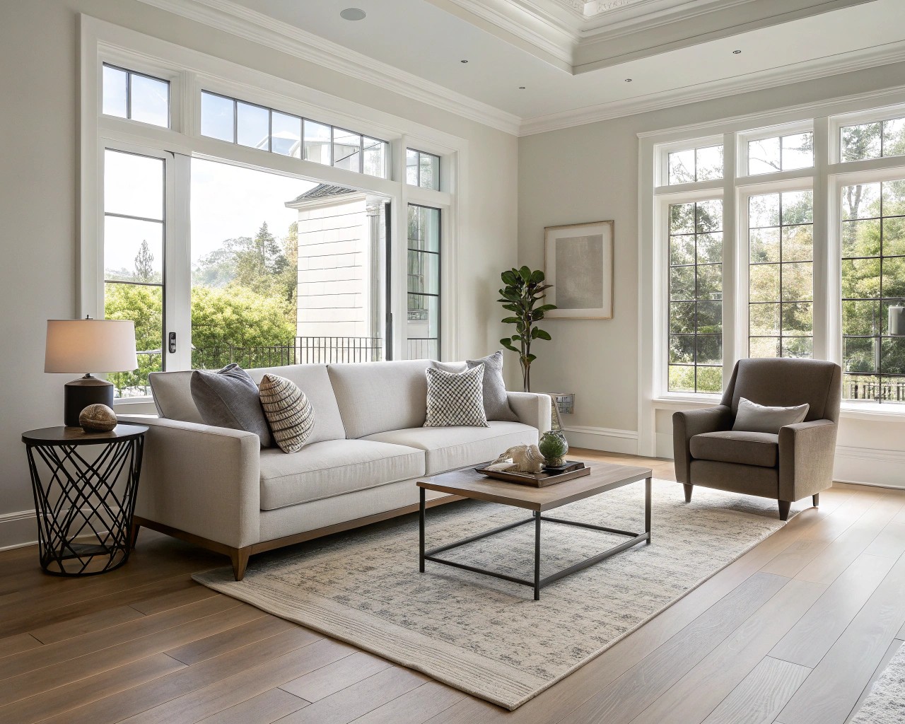
Walking into a room where everything feels “just right” isn’t accidental—it’s the result of masterful proportion and scale. These principles ensure that each element relates harmoniously to the others and to the overall space.
The Rule of Thirds
In professional practice, the rule of thirds has proven invaluable for creating balanced compositions:
- Divide your space (or wall) into a grid of nine equal parts
- Place focal points at the intersections of these lines
- Aim for approximately one-third furniture, one-third open space, and one-third accent pieces
This approach consistently yields visually satisfying arrangements that feel intentional rather than arbitrary.
Furniture Scaling Guidelines
| Room Size | Furniture Scale | Example Pieces |
|---|---|---|
| Small | Low-profile | Armless chairs, bench seating, glass tables |
| Medium | Mid-size | Standard sofas, medium bookcases |
| Large | Substantial | Sectionals, grand bookcases, statement tables |
Remember that scale is relative—what works perfectly in a Greenwich Village apartment would overwhelm a studio while appearing diminutive in a Hamptons estate.
Balance: The Art of Visual Equilibrium
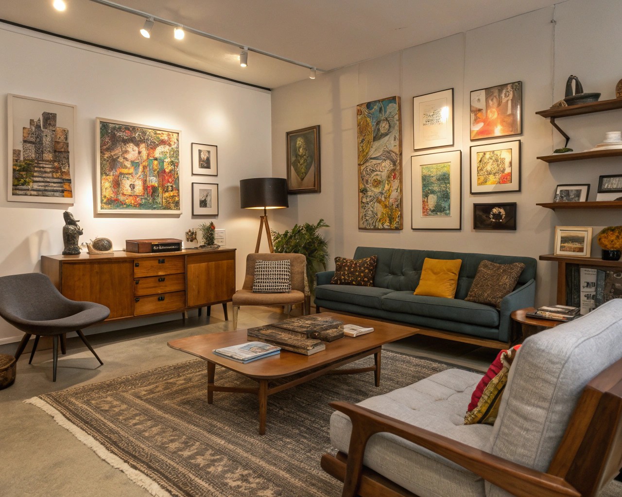
Balance creates stability and order within a space. After years of designing homes across different architectural styles, I’ve found that understanding three types of balance allows for versatility in design approaches.
Three Types of Balance
Symmetrical Balance
- Creates formal, traditional atmospheres
- Mirrors elements across a central axis
- Perfect for classic dining rooms and formal living spaces
- Provides immediate visual satisfaction and stability
Asymmetrical Balance
- Achieves equilibrium through visual weight rather than mirroring
- More dynamic and contemporary feeling
- Accommodates unique architectural features
- Requires careful attention to the “weight” of colors, textures, and forms
Radial Balance
- Arranges elements around a central focal point
- Creates dramatic, conversation-encouraging spaces
- Exemplified by round dining tables or seating circling a fireplace
- Particularly effective in rooms where social interaction is primary
Unity and Harmony
Creating a cohesive design requires thoughtful consideration of how elements work together:
- Repetition of key colors, patterns, or forms throughout a space
- Consistent language in furniture styles and design elements
- Thoughtful transitions between rooms through connecting elements
When designing across multiple rooms, I always ensure at least three connecting elements carry through the spaces—whether specific colors, materials, or design motifs—to maintain a sense of wholeness while allowing each room its unique character.
Lighting Philosophy: Sculpting Space with Illumination
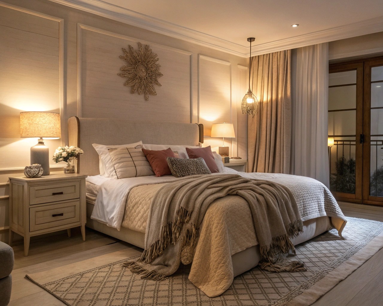
After two decades of designing spaces, one truth remains constant: no matter how perfect your furniture arrangement or color selection, poor lighting will undermine everything. Lighting is not merely functional—it’s the element that brings all other aspects of design to life.
The Three Layers of Lighting
Every well-designed space incorporates these essential lighting layers:
Ambient Lighting (General Illumination)
- Provides overall illumination
- Usually ceiling-mounted fixtures, recessed lighting, or pendants
- Sets the base light level for the room
Task Lighting (Functional Illumination)
- Illuminates specific activities
- Includes desk lamps, under-cabinet lighting, reading lamps
- Should be glare-free and adjustable when possible
Accent Lighting (Highlighting)
- Draws attention to architectural features or décor
- Creates visual interest and depth
- Includes track lighting, picture lights, and directional recessed fixtures
Room-Specific Lighting Considerations
| Room | Primary Purpose | Key Lighting Elements | Common Mistakes |
|---|---|---|---|
| Living Room | Multi-functional | Multiple sources at different heights | Relying solely on overhead lighting |
| Kitchen | Task-oriented | Under-cabinet, pendant, recessed | Insufficient task lighting |
| Dining Room | Atmospheric | Dimmable chandelier or pendants | Fixtures hung too high |
| Bedroom | Relaxation | Layered, soft lighting | Harsh overhead lighting |
| Bathroom | Functional + flattering | Sconces at eye level, overhead | Poor vanity lighting |
The golden rule: every room needs at least 2-3 light sources to create proper ambiance and functionality.
Lighting Techniques for Visual Interest
- Wall washing: Illuminating walls evenly to increase perceived space
- Grazing: Positioning light at an angle to highlight textured surfaces
- Silhouetting: Backlighting objects to create dramatic profiles
- Cross-illumination: Lighting from multiple angles to reduce harsh shadows
Never underestimate the importance of dimmers in every room—they’re the simplest way to transform atmosphere and accommodate different activities within the same space.
The Art of Texture: Adding Dimension and Depth
A room without texture is like a canvas without brushstrokes—technically complete but lacking soul. Texture provides the tactile and visual interest that elevates design from merely attractive to genuinely compelling.
Types of Texture in Design
- Tactile Texture: Physical surfaces you can feel (rough stone, smooth glass, soft fabric)
- Visual Texture: Perceived texture created through pattern or color variation (wallpaper, prints, certain paint techniques)
Strategic Texture Implementation
Working with texture requires a thoughtful approach:
Layer different textures within a space to create depth
- Combine smooth with rough, matte with glossy, soft with hard
- Example: Velvet pillows on a leather sofa with a wooden coffee table
Use contrasting fabrics for visual interest
- Mix linens, velvets, wools, and silks for dimension
- Heavier textures ground spaces while lighter textures add airiness
Incorporate natural elements
- Wood grain, stone, plants, and botanical elements
- These elements add authenticity and connection to nature
Create balance through texture families
- Pair related textures (like various woven materials) for cohesion
- Contrast with completely different texture families for interest
Texture by Room
Certain textures work particularly well in specific rooms:
Room Textures and Effects
| Room | Recommended Textures | Effect Created |
|---|---|---|
| Living Room | Varied soft furnishings, mixed metals | Inviting, layered comfort |
| Kitchen | Contrasting countertops, backsplashes | Functional interest |
| Bedroom | Textiles of varying weights | Cocoon-like comfort |
| Bathroom | Natural stone, textured tile | Spa-like experience |
Remember that texture isn’t just about how things feel—it’s about creating visual rhythm and preventing spaces from appearing flat or two-dimensional.
Bringing It All Together: The Integration of Principles
The true magic happens when these principles work in concert. A well-designed space considers color theory, proportion, balance, lighting, and texture as an integrated system rather than isolated elements.
The Interior Design Process
After years of refining my approach, I follow this sequence when designing spaces:
- Assess the architecture and natural light (the unchangeable elements)
- Establish the color story based on client preferences and room function
- Determine the balance approach most appropriate for the space
- Plan the lighting design to enhance all other elements
- Layer in textures to add dimension and interest
- Edit ruthlessly until perfect harmony is achieved
Telling Your Story Through Design
The most compelling spaces tell stories through their design elements. Whether it’s incorporating personal artifacts that reflect travels, creating a design theme around a central concept, or using color to set an emotional tone, the principles outlined here serve as tools for self-expression.
Remember that while rules provide foundation, true design mastery comes from knowing when and how to bend them to create spaces that not only function beautifully but also resonate on a personal level.

